Turning Your Logo Into a Neon Sign: What to Get Right
Not every logo can become neon as it is. Line thickness, colour limits, file formats and viewing distance: what to know before you make a logo neon sign.
By Emre Neon5 min read
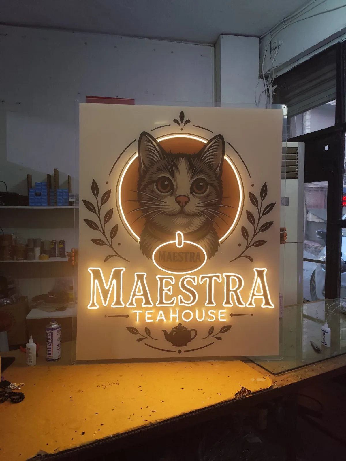
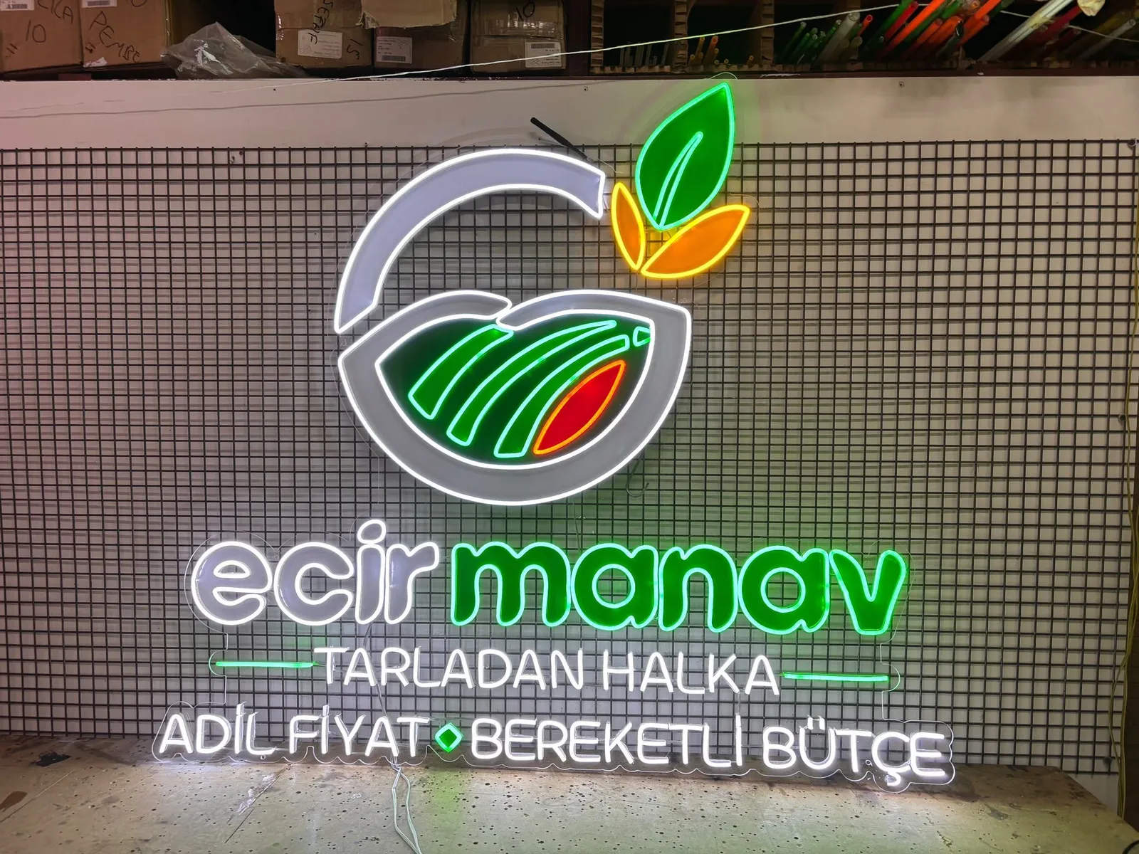
Your logo may look great on paper and on screen, but a neon sign is a different medium. Light is drawn with a line, and every line has a thickness and a bending limit. Turning a logo into neon is less about copying it and more about making it drawable in light.
This guide walks through the decisions you will meet when preparing a logo neon sign: lines, simplifying, colour, size, distance and file prep.
Why a neon logo is not an exact copy
In print, shadows, gradients, hairlines and tiny text are no problem. In neon you have a glowing line and a halo around it. Lines run at a certain thickness and curve, and two lines placed too close can merge into one glow.
A good neon logo keeps what makes the original recognisable and adapts its form to light. That adaptation is mostly a simplifying exercise, and it goes through your approval.
Line thickness
On a neon sign every stroke is a single line. If your logo has a thick, filled letter, neon may solve it as an outline or a few parallel lines. A very thin stroke, on the other hand, may be thickened slightly.
Watch for:
- Enough space between lines. Two close lines can read as one blob once the glow is added.
- Very sharp corners and tight curves may not be workable; the maker may suggest softening them.
- Line thickness has to be considered with size. The same stroke can look bold on a small sign and thin on a large one.
What thickness and curve are possible depends on the product type, so it is best to settle the final call with your maker.
Legibility
A logo can be recognisable on its own, but in neon the silhouette is read first. Ask yourself: could someone glancing at the sign for a few seconds understand the brand?
A few habits that help:
- Consider the wordmark and the symbol separately. Sometimes only the text or only the symbol becomes neon.
- Open up letter spacing. The glow pulls letters visually closer.
- Mind contrast. Bright, saturated lines separate better against a dark wall.
Simplifying: what to keep and what to drop
Simplifying does not mean ruining the logo. The goal is to keep the main lines that identify the brand.
Typically reviewed:
- Small text and taglines: often removed or handled as a separate, simpler line.
- Gradients and shadows: become a flat colour or a single line.
- Inner details: many nested shapes are reduced to a few main lines.
- Fills: solid areas are redrawn as outlines.
Do not approve anything before you can see what you are losing. Production starts only after the simplified draft has been shown to you and approved. For the general process, see how neon signs are made.
Brand colours and the limits of the neon palette
Your brand colour is defined by a code in a style guide; neon works with light-emitting colours. The two often do not match exactly.
Things to know:
- Neon colours come from a limited palette. We pick the closest option to your brand colour together with you.
- Screen and print colours look different from a lit tube or strip.
- Gradients, multi-tone fills and shadows cannot be carried over as they are.
- Think about both states. The sign looks different switched off than switched on.
If your identity uses many colours, a one- or two-colour neon version is a common and effective solution. We also have a piece on colour and lettering: choosing neon sign colors and fonts.
Size and viewing distance
Size should follow the distance the sign will be seen from, not simply the free space on the wall. A sign viewed from two metres inside a cafe needs a different size from a facade sign facing a street.
When deciding:
- Write down how far away people will look at it from.
- As distance grows, thin lines and small details fade; thicker strokes and simpler shapes work better.
- When a logo is scaled down, its details crowd together. A smaller sign may need more simplifying.
- Measure the available wall area and the space around it, and share both.
Larger signs are easier to see, and size also changes the cost factors. For more on that, read what determines neon sign prices.
Which file formats should you prepare?
The maker needs a clean file to redraw your lines at the right scale.
| Format | Status | Note |
|---|---|---|
| SVG | Preferred | Vector; scales without loss |
| PDF (vector) | Preferred | Logo should be saved as paths |
| AI | Preferred | Convert text to outlines if possible |
| PNG | Acceptable | High resolution, clean plain background |
| JPG | Last resort | Compression can blur edges |
When preparing files:
- Send the vector if you have one; otherwise pick the largest, sharpest PNG.
- Screenshots and small images copied from a social profile cause trouble because their edges are blurry.
- If you have several versions (horizontal, stacked, single colour), send them all.
- Note the name of the font you use.
Logo upload and quote flow
On the Emre Neon site, the process runs like this:
- Open the configurator's logo mode and upload your logo file.
- Choose size and colour options and preview your logo as neon.
- Request a quote via WhatsApp or the contact form.
- The design is shown to you and confirmed.
- After confirmation comes production, then delivery and installation.
When you upload, mention where the sign will go, such as a wall, window or desktop; it affects the product type.
Summary
A good logo neon sign does not imitate the original; it makes the logo drawable in light. Think early about line thickness, simplifying, colour limits and viewing distance, and the draft stage becomes clearer.
When you are ready, upload your logo and preview it, then send it to us for a quote. For any question about your file, message us on WhatsApp.
Frequently asked questions
Vector if you have it: SVG, PDF or AI. Vector files give clean line paths and scale properly. If you have no vector, a high-resolution PNG with a clean background also works.
Not always. A neon sign works with light-emitting colours, and gradients or shadows cannot be reproduced exactly. We choose the closest neon colour to your brand colour together with you.
Very thin lines, small text and tightly packed details are usually simplified. We show you the simplified design for approval, and production does not start before you confirm.
Upload your logo in the logo mode of the configurator to preview it as neon. For pricing, send the design to us or contact us via WhatsApp or the contact form.