How to Choose Neon Sign Colors and Fonts
The same words read very differently in another color or font. Here is what to check before you pick the color and lettering for your neon sign.
By Emre Neon7 min read
A neon sign is shaped by more than the words on it. The same word in a different color and font can carry a completely different mood. The right choice is rarely the one that looks best in isolation. It is the one that reads best on your wall, in your lighting, from where your viewers will stand.
This guide walks through the questions to ask, in order, when choosing neon sign colors and neon fonts. A short checklist at the end helps you wrap up the decision.
Start with the brand: consistency beats preference
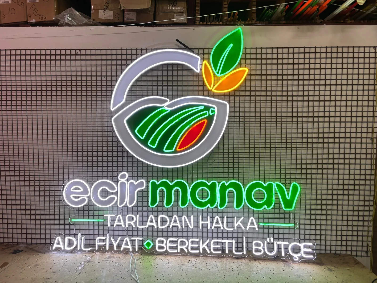
If you run a business, start from your existing logo and packaging. When your menu, signage, social media and packaging share one color family, a neon sign completes that picture. A neon in an unrelated color can make you harder to recognize.
A few practical notes:
- If your logo has two colors, ask your manufacturer whether the sign can be made in both. Often a simplified, single-color version looks cleaner.
- If your logo uses many shades or gradients, don't try to carry them all over. Choose the main color and one accent.
- A near match to your brand color is often enough. Neon emits light, so it is never perceived exactly like ink on paper.
If you want to convert your logo directly, the configurator has a logo upload mode. Fine detail tends to disappear in neon, so some simplification is usually needed.
Wall color and background: neon is read against what is behind it
When you picture the sign in your space, look at the surface behind it as well. The same red can look sharp on a dark charcoal wall and washed out on a light one.
Dark backgrounds
Dark walls, black panels and dark wood are the easiest backgrounds for neon. Almost every color stands out here, and deeper tones such as purple and blue read comfortably too.
Light backgrounds
On white or pale walls, the effect can weaken in daylight. You have two options: mount the sign on a dark backboard, or pick a high-contrast color. Pale tones like Ice Blue or Lemon Yellow can vanish on a light wall, while saturated tones such as Pink, Red or Blue tend to hold up better.
Textured and colored walls
Brick, stone and patterned walls affect how both the lines and the colors read. On a busy surface, a bolder, simpler design is the safer path than a thin, intricate one. If you are unsure, send your manufacturer a photo of the wall.
If your wall is light or busy, it is worth browsing the options on the products page, including options such as mirror/plexi neon.
Contrast and legibility: what can you see from a distance?
A design that looks wonderful up close may not read from across the room or the street. Ask yourself: can this be read at a glance from where my audience will actually stand?
A few principles that improve legibility:
- Bright neon on a dark background. This is the most reliable combination.
- Keep the color count low. One main color and at most one accent is usually enough. Many colors blur together from a distance.
- Leave space between words. A tight layout can make letters appear to merge once the light spreads.
- Don't place similar shades side by side. Pink next to Dark Pink, or Lemon Yellow next to Golden Yellow, doesn't create the contrast you expect.
Also judge the sign in the real light of the room. A sunlit shop window and a dim cafe wall treat the same color very differently.
Mood: warm white or cool tones?
Color is not only about visibility. It sets the atmosphere. Here is one way to group the configurator's options by feel:
| Color group | Options | General feel |
|---|---|---|
| Warm tones | Warm White, Golden Yellow, Orange | Cozy, inviting, relaxed |
| Energetic tones | Red, Pink, Dark Pink, Lemon Yellow | Attention-grabbing, lively, playful |
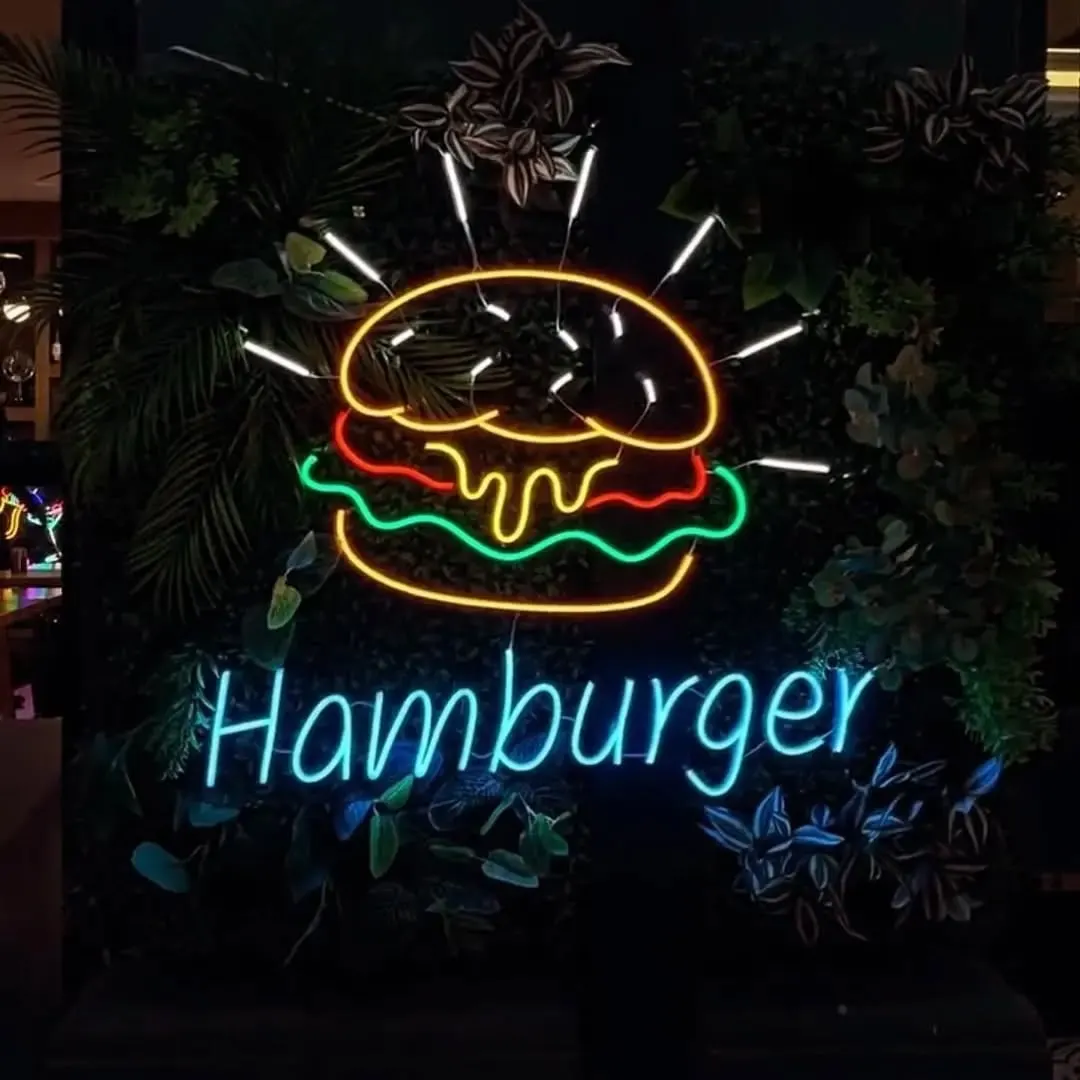
| Cool tones | Blue, Ice Blue, Purple, Green | Modern, calm, or nightlife |
| Neutral | White | Clean, simple, fits most settings |
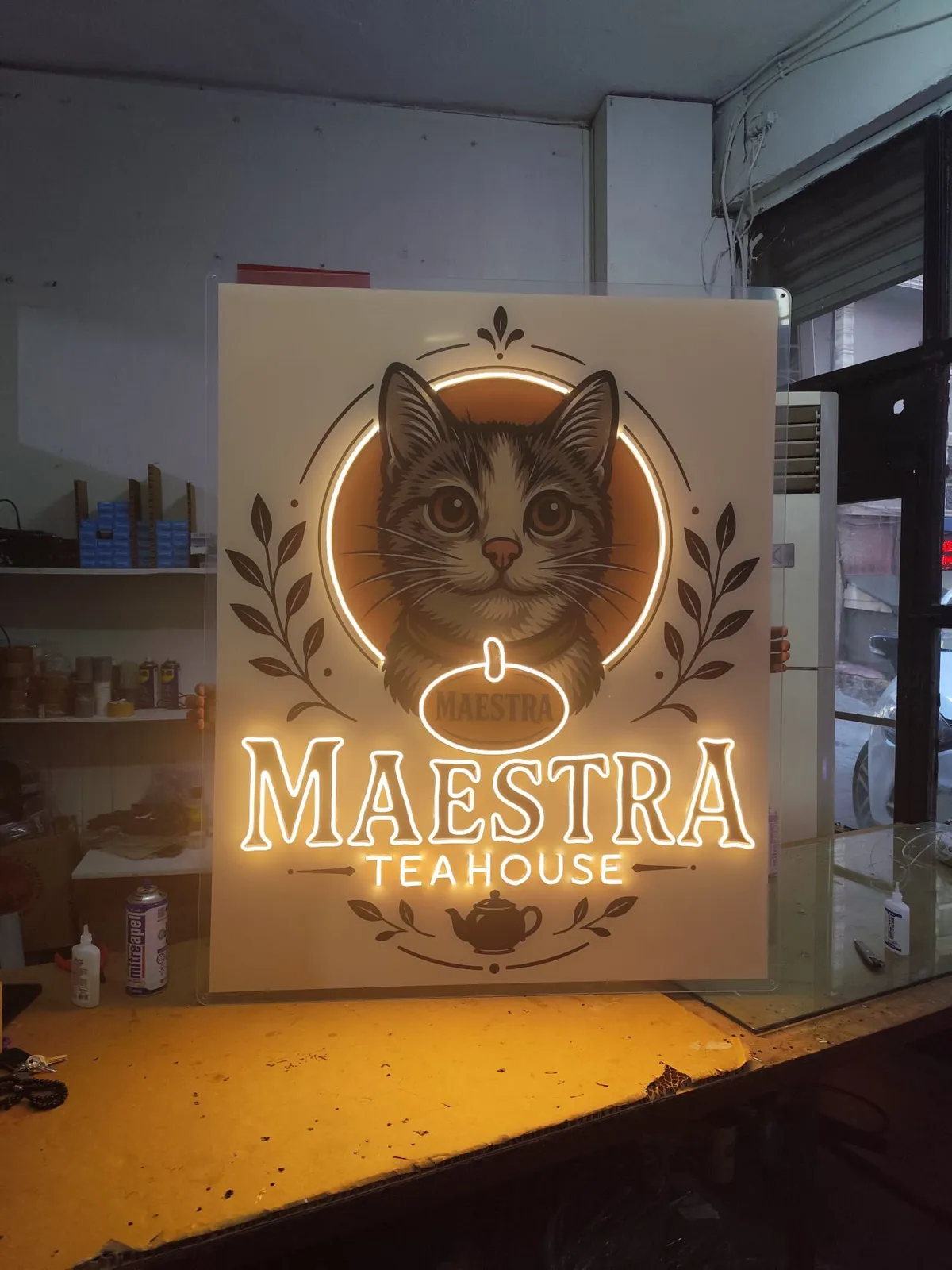
This is a tendency, not a rule, and cultural associations and context always matter. Still, the grouping holds up in practice: warm tones tend to suit places meant for relaxing and talking (cafes, homes, bedrooms, restaurants), while lively and cool tones tend to suit energetic, showy settings (bars, events, shop windows).
The difference between Warm White and White looks small but changes a room. Warm White leans toward yellow and feels soft. White looks more neutral and crisp. If the other lights in your space are warm, Warm White usually blends in better. If they are cool, White usually does.
Script or bold: choosing the lettering style
After color, the font is the second big decision. There are two main directions.
Script fonts
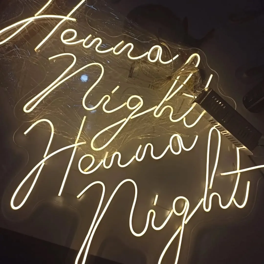
Script lettering feels fluid, personal and romantic. It is popular for weddings, hair and beauty salons, bedrooms and short names. It has limits, though:
- Because letters connect, the text reads as one flowing line. That looks lovely, but individual letters can be harder to tell apart.
- Very thin or ornate scripts lose legibility at a distance.
- In some fonts the difference between capital and lowercase letters gets vague.
Script is ideal for short, one-word names and taglines. Longer sentences can be a struggle.
Bold and simple fonts
Thick, plain, block-style fonts are the easiest to read from far away. They are a safe choice where legibility comes first, such as shops, offices, cafe signs and wayfinding. They give a more direct, no-nonsense look.
Mixing the two
You can use two fonts on one sign, for example a bold name with a script tagline underneath. The key is that they don't compete. One should lead and the other should support.
Turkish characters: checking ğ, ş, ı and İ
This one is easy to miss and matters a lot on a Turkish sign. Some fonts were not designed with Turkish in mind, which can cause problems with dotted or tailed letters.
What to check:
- ı and İ: dotted and dotless i must be clearly distinct, so that pairs like "IŞIK" and "İŞİK" don't blur.
- ğ: the curve above the letter can be faint, especially in script fonts, and at small sizes may look detached from the letter.
- ş and ç: the tail can get tangled with connecting letters in script fonts.
- ö and ü: the dots are small separate elements, and at small letter heights they can get lost.
In script fonts especially, these marks can merge into the line and make a letter read as a different one. The fix is simple: preview your complete text, marked letters included, in the font you plan to use, and see whether each one reads clearly. If your brand name contains these characters, raise it with your manufacturer during approval.
Letter height: how big should it be?
Letter height decides whether a font and color will actually work. A thin, detailed font at a small size can get cluttered in neon tubing. The same font is comfortable at a larger size.
When deciding, consider:
- Viewing distance: a wall neon seen from a few steps away is not sized like a sign meant for the street.
- Wall space: the sign doesn't need to fill the wall. Leaving breathing room often looks better.
- Number of lines: more lines mean each line gets shorter in height, which hurts legibility. Trim the text if you can.
- Font character: thin, ornate fonts need more size, while bold fonts hold up at smaller sizes.
Exact dimensions and minimum letter sizes depend on the product type (LED neon, glass neon, channel letters) and the design, so it is best to settle them together with your manufacturer at the design stage. For how placement affects choices, see our article on indoor vs outdoor neon signs.
A short checklist
- Do I have a brand color and logo? If so, build on them.
- Is my wall light or dark, plain or textured?
- From what distance will the neon be read?
- What is the mood of the space: warm, lively, calm?
- Is the text short? Script or bold font?
- Do ğ, ş, ı and İ read clearly?
- Is the letter height right for the wall and the distance?
Try your own design
Instead of imagining color and font on paper, type your text and compare the options side by side. In the neon configurator you can enter your text, try colors from Warm White to Purple, and test fonts. When you like a design, send it to us to request a quote via WhatsApp or the form, and we can settle any remaining questions about color or legibility during approval.
Frequently asked questions
There is no universal best. On dark, plain walls Warm White or White usually works without trouble. If your logo has a brand color, keeping that color is generally the better call.
Screens can display colors differently, and a glowing neon tube is perceived differently from an image on a display. If the exact shade matters, talk it through with your manufacturer and confirm it during design approval.
Not at all, but very thin or tightly connected scripts can be hard to read from a distance. Script works well for a short name or tagline. For longer lines, clearer letterforms are usually easier to read.
In some fonts the marks on ğ, ş, ı and İ are missing or cramped. Preview your full text in the font you choose and make sure the marked letters are clearly legible.
Base it on the distance people will view the sign from. A wall neon seen from a few steps away is not sized like a sign that must be read from across the street. It is best to settle the size together with the dimensions of the wall it will go on.