A Business Guide to Choosing a Neon Sign
What to check when choosing a neon sign for a cafe, restaurant, barber, beauty salon, shop, office or studio: legibility, placement, brand fit and distance.
By Emre Neon6 min read
Choosing a business neon sign is about more than liking a design. The sign has to be visible from the street, consistent with your brand and placed in the right spot. This guide walks through the questions to ask for cafes, restaurants, barbers, beauty salons, retail shops, offices and studios.
Define the sign's job first
Before choosing, decide what you want the sign to do. There are three basic jobs:
- Attract attention: Get passersby to notice you (window, facade)
- Direct people: Show the business name and the entrance
- Set the mood: Let people feel your brand once inside (interior wall, behind the counter, waiting area)
One sign rarely does all three perfectly. Pick the primary job and design around it.
Legibility, distance and placement
Legibility
A sign that looks good but can't be read doesn't work. What decides legibility:
- Typeface: Bold, simple typefaces read well from a distance. Thin, handwriting-style fonts look great up close.
- Letter spacing: Letters set too close can seem to merge once they glow.
- Size: It should match the distance it will be read from.
- Color and background contrast: The light color shouldn't clash with the wall behind it.
- Text length: Fewer words are read faster.
Viewing distance
Think about who will see the sign and from how far. A rough guide:
| Location | Typical viewer | Design approach |
|---|---|---|
| Facade / sidewalk | Pedestrians or people in vehicles | Large, simple, bold lines |
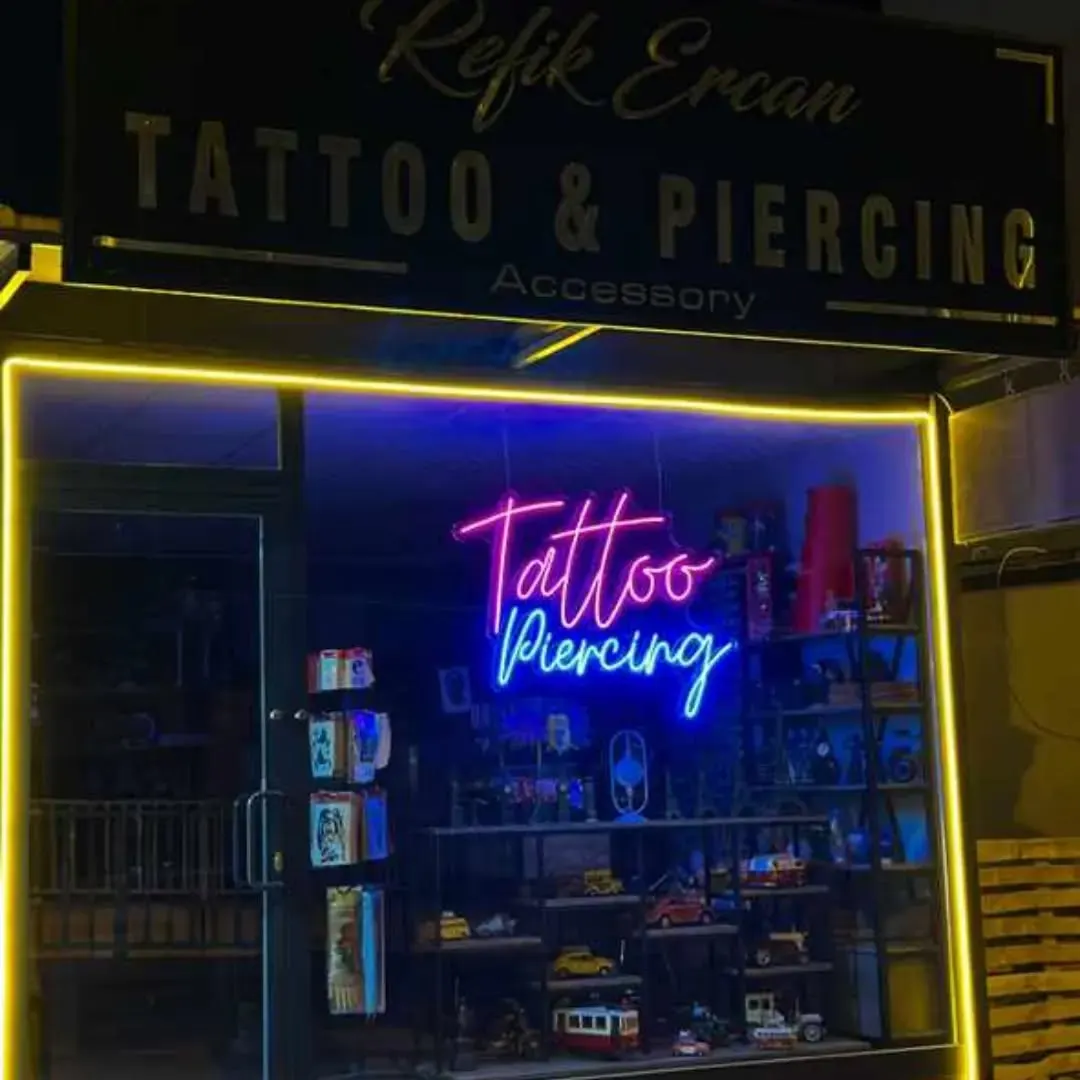
| Window | People walking up to the door | Medium size, clear name or logo |
| Interior wall | Seated or queuing customers | Fine detail and thin lines can work |
| Reception | Visitors being greeted | Corporate, clean |
If you can, visit the spot at different times of day and look at where the sign will go from a few steps back. This simple test prevents many placement mistakes.
Placement and location
Where the sign goes matters as much as which sign you choose. Check:
- Will it be at eye level or higher up?
- Is a tree, pole, awning or other obstruction in front of it?
- Is the surface behind it flat or textured? Light looks different on brick, wood or dark paint than on a plain white wall.
- Is another illuminated sign nearby?
- How far is the nearest power outlet?
- Do you need permission from the landlord or building management?
Facade signs may be subject to municipal or building rules. Check permissions early. Your manufacturer can advise, but the responsibility is yours.
Brand fit and environment
Brand fit
A neon sign should extend your visual identity. When your logo colors, typeface and overall feel carry through, the result is consistent.
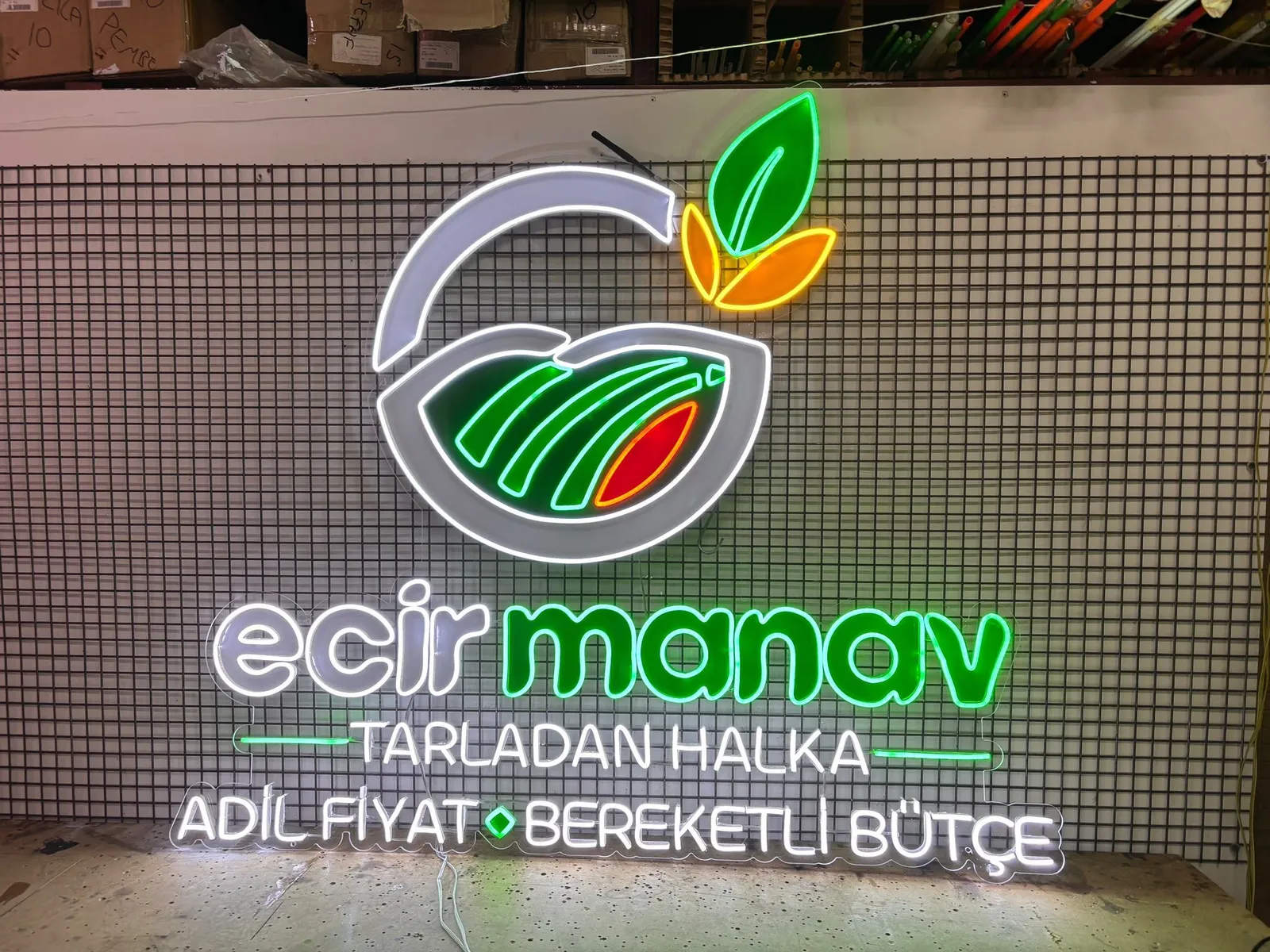
- If you already have a logo, adapting it to neon lines is the strongest option. The logo upload mode is built for this.
- If you don't, write your name in your brand color with a consistent typeface.
- Keep it in harmony with the space's colors, furniture and other lighting.
- Stay with one or two main colors rather than many.
Indoor or outdoor?
Indoor signs generally allow more freedom: fine detail, pastel colors and intricate designs work comfortably. Outdoors, rain, sun and wind come into play and the build is planned for them. Channel letters and lightboxes are common choices for facades.
State clearly which conditions the sign must suit, and ask your manufacturer for durability and protection details in writing.
Which technology fits where?
As a general frame, these pairings come up in most projects. For a final decision, discuss your space with your manufacturer.
| Need | Common choice |
|---|---|
| Flexible, free-form text or drawings indoors | LED neon (flex) |
| Classic neon look | Glass neon |
| Three-dimensional letters on a facade | Channel letters |
| Logo-heavy, back-lit surface | Lightbox |
| Light reflected on a glossy surface | Mirror / acrylic neon |
This table is a starting point; other choices can be right for the same type of business. What matters is basing the decision on viewing distance, location and brand need.
What about cost?
Cost varies with size, design and installation. Prices are not listed on the site; design your sign in the configurator, send it to us or contact us, and we share the price after reviewing it.
Ideas by business type
These are starting points, not fixed rules.
Cafe
In a cafe, neon mostly sets the mood. A name or short tagline behind the counter, in a photo corner or in the window works well. Simple symbols like a cup or a coffee bean are options. Warm tones tend to feel relaxed.
Restaurant
A restaurant has two separate needs: the name visible outside and the atmosphere inside. Outside, a legible name sign; inside, a graphic that fits the theme of the kitchen or menu. A dimmer can help keep a bright sign from distorting how food looks in the dining area.
Barber
Classic symbols (scissors, comb, pole) and the name stand out. A short, clear message in the window and a brand moment on the wall around the mirrors both work. For legibility, choose a simple typeface.
Beauty salon
Soft colors and elegant lines are common in salons. A neon in the waiting area or at reception strengthens the brand. You can browse the options on the products page.
Retail shop
In a shop, the window and facade come first. The name or logo should be sized for reading from a distance. Small neons that mark a section or the checkout area help with wayfinding inside.
Office
In an office the goal is a professional image, not show. A simple single-color design on the reception wall, at a meeting room entrance or in a shared area is enough. A brightness setting (dimmer) adds comfort for people who spend long hours in the same room.
Studio
In photo, dance, yoga, podcast or tattoo studios, neon doubles as identity and a backdrop for content. Think about how it looks on camera: a very bright sign can blow out in photos, so adjustable brightness helps.
For more examples, browse the applications page.
Checklist before you decide
- Is the sign's main job clear: attention, direction or mood?
- Are size and typeface chosen for the viewing distance?
- Is the spot confirmed with photos and measurements?
- Are brand colors and the logo ready to use?
- Is it clear whether the sign is indoor or outdoor?
- Have the power outlet and mounting surface been checked?
- Have the required permissions been looked into?
- Do you need brightness control (dimmer)?
Conclusion
A good business sign is readable, well placed and consistent with the brand. Define its job first, then choose size and technology based on distance, location and setting. Share photos of your space, measurements and your idea, and get in touch so we can work out the right solution together.
Frequently asked questions
It depends on where it will go. LED neon or glass neon is common for an indoor brand wall, while channel letters or a lightbox are often chosen for a facade. If you're unsure, send photos of the space to your manufacturer.
Legibility depends on stroke thickness, typeface, color and overall size. Simple, bold, large lettering reads best at a distance. Thin, ornate scripts suit close viewing.
If you want to attract people passing by, the window makes sense. If you want to build the brand once customers are inside, choose an interior wall. Many businesses use both.
Most logos can be adapted to neon lines, though filled areas, gradients and very fine detail may be simplified. A vector file makes the process easier.