LED Neon, Channel Letters and Lightboxes: Which Goes Where?
Three sign types, three different strengths. A practical comparison by storefront, interior, logo, viewing distance, style, care and custom shapes.
By Emre Neon5 min read
"Channel letters or neon?" is one of the most common sticking points for businesses ordering a sign. The answer is rarely one winner. It depends on where the sign will hang, who will look at it from where, and how you want your brand to feel.
This article compares LED neon, channel letters and lightboxes across seven criteria. The goal is not to promote one, but to make clear when each makes the most sense.
The three types in brief
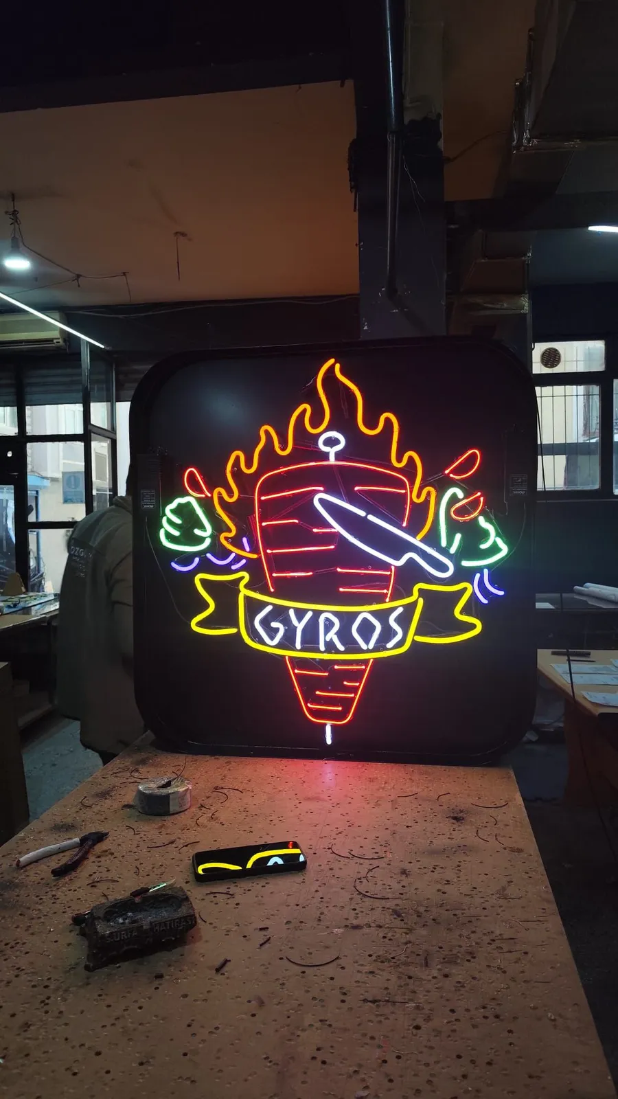
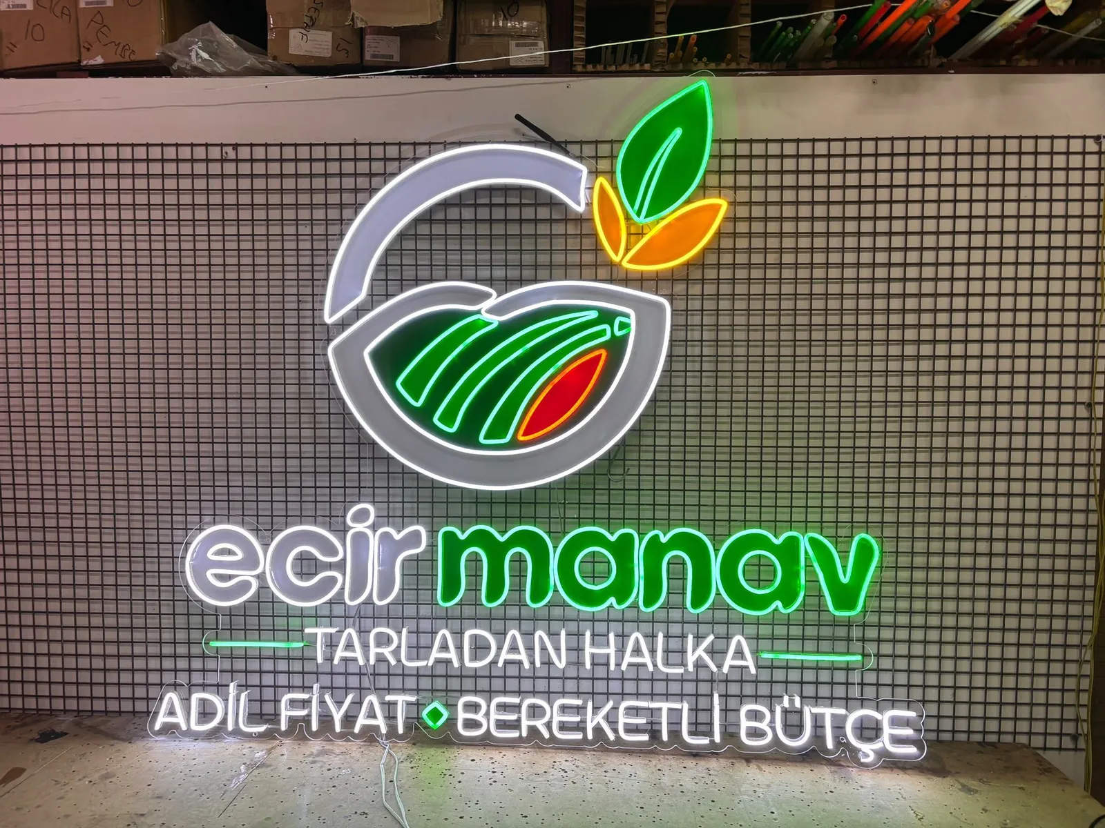
LED neon is a flexible light strip routed along a design on an acrylic or similar backboard. It gives the look of classic neon tubing, and text, lines and icons can be drawn in flowing shapes. You can browse LED neon products.
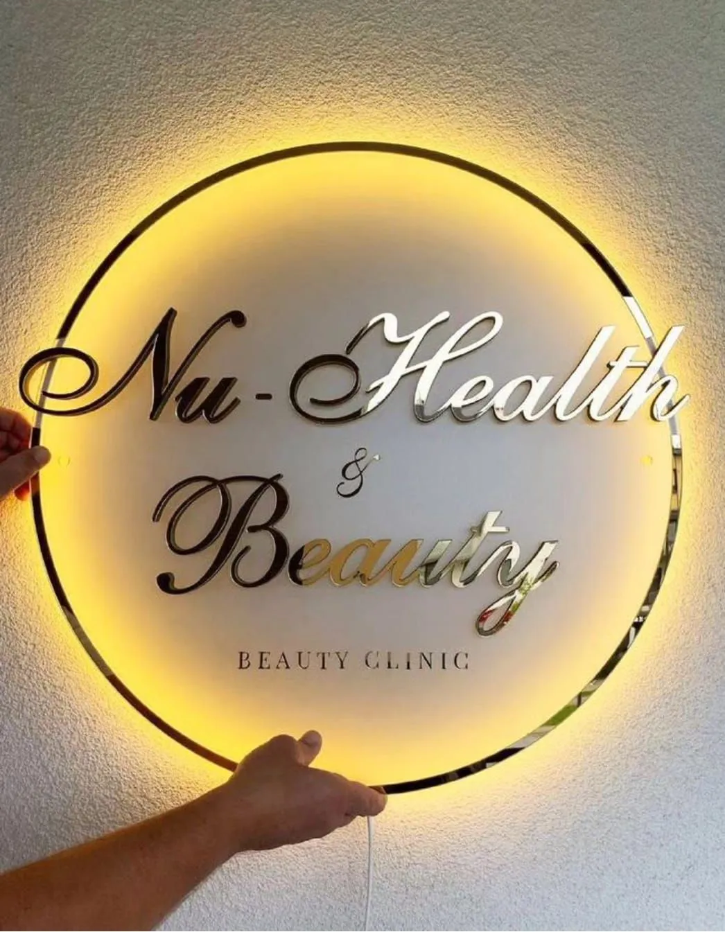
Channel letters are signs where each letter or shape is built as its own three-dimensional body. Light usually shows through the face, from the sides, or as a glow on the wall behind. See channel letter options on the products page.
A lightbox is an illuminated box with a print, cut-out or translucent graphic on its face, usually in a rectangular form. Here are the lightbox options.
Comparison table
The table summarizes general tendencies. Every project is different, and size, materials and environment can change the outcome.
| Criterion | LED neon | Channel letters | Lightbox |
|---|---|---|---|
| Facade / outdoor | Strong in sheltered spots and windows; outdoor suitability depends on the maker and model | Often the first choice | Common, familiar option |
| Indoor | Its strongest ground | Good for corporate interiors | Good for menus, wayfinding, info |
| Logo application | Good for line-based and script logos | Good for bold, solid logos | Flexible for colorful, detailed logos |
| Reading from far away | Often best at close and medium range | Frequently chosen for long distance | Medium to long distance |
| Style | Retro, handwritten, warm, friendly | Clear, corporate, silhouette-driven | Panel look, tidy, informative |
| Care | Wipe surface, keep connections dry | Same; outdoor cleaning may be more frequent | Same; a dirty face is noticeable |
| Custom shapes | Very flexible for curves, icons, handwriting | Limited to letter silhouette but strong | Panel shape is fixed, content is free |
Choosing by space
Storefront and facade
On a facade, the sign has to answer "what is this place?" for someone walking or driving past. Legibility and distance decide most things here.
In many projects, channel letters are the first choice for the facade: letters stand out individually, the silhouette reads clearly, and the sign feels integrated into the building. A lightbox is practical when one surface has to carry both the name and extra information, such as a subtitle or phone number.
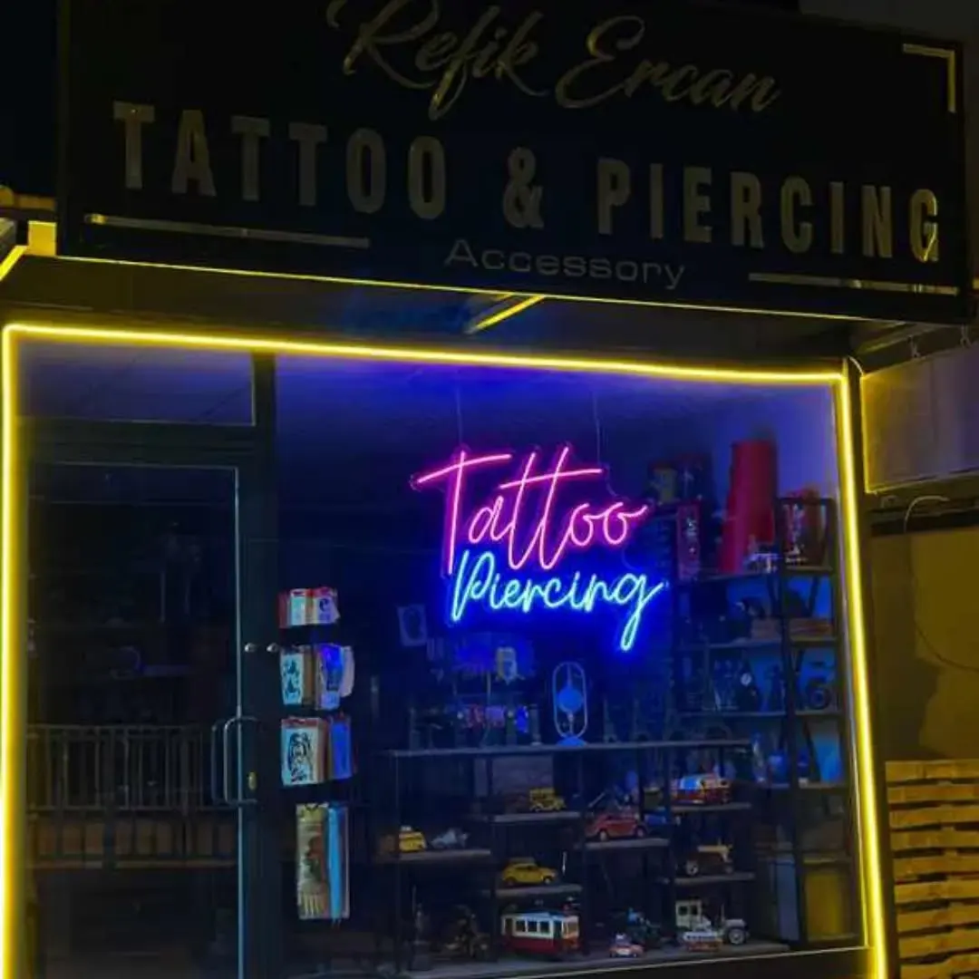
LED neon can be used on a facade too, but suitability for outdoor conditions varies by maker and model, so ask during the design step. Neon hung inside a window, facing the street, is a different case: behind glass it is sheltered and has a strong effect from the sidewalk.
Interior
Indoors, viewing distances are short, the environment is controlled and atmosphere matters. For cafes, barbershops, beauty salons, offices and studio walls, LED neon is often the standout. Its curves, warm glow and handwritten look give a space character.
Channel letters work indoors as well, especially for a corporate logo on a reception wall. Lightboxes make sense for functional uses like menu boards, category wayfinding and information panels.
Logo, distance and style
Logo application
Your logo's structure determines which type needs the fewest compromises.
- Bold, solid-shaped logos: channel letters and lightboxes carry these easily.
- Thin-line, script or single-stroke logos: a natural candidate for LED neon.
- Multi-color, detailed or gradient logos: a lightbox is usually more flexible with color and detail. With LED neon, details may need simplifying.
Whatever the type, very small details and lines placed very close together can cause trouble in production. When you upload your logo, simplification suggestions can be discussed during design.
Viewing distance
A rough guide by distance:
- Close (interiors, in front of a window): LED neon does very well.
- Medium (a street, a short block): all three work; style and logo decide.
- Far (wide avenues, tall facades): channel letters and lightboxes are usually preferred, with letter size and contrast doing most of the work.
Size, color and background contrast can matter more than type. Light-colored light on a light-colored facade loses legibility whichever type you choose.
Style and atmosphere
The three speak different visual languages:
- LED neon: retro, handwritten, friendly. A natural fit for walls people photograph and share.
- Channel letters: confident, clear, corporate. The silhouette becomes the brand.
- Lightbox: informative, orderly, panel aesthetic. Good for menus and service lists.
A warm, friendly brand may feel more natural in neon and a serious corporate one in channel letters, but this is not a rule. A single neon accent wall can work well in a corporate office.
Care and flexibility
Care
Day-to-day care is similar across all three: switch off and unplug, wipe the surface with a soft damp cloth, and keep the adapter in a dry, ventilated place. Outdoor signs collect dust and dirt faster, so cleaning may be needed more often. When a lightbox face gets dirty, the light distribution can visibly change.
For any electrical, transformer or wiring problem, do not open or repair the unit yourself; contact a professional.
Custom shapes and flexibility
If you want a non-standard shape, icon, drawing or handwriting, LED neon imposes the fewest limits. Channel letters work from a letter or shape silhouette, so they support custom forms, though fine detail is limited. On a lightbox the outer shape of the panel is usually fixed, while the content is free.
Mixed solutions are common: channel letters on the facade and an LED neon wall inside, or neon in the window and a lightbox at the entrance. You do not have to pick just one.
Questions to ask your maker before choosing
- Is this type suitable for where it will hang (interior, outdoor, window)?
- Which details of my logo should be simplified?
- What does the wall or facade need for mounting?
- What are the options for electrical connection, adapter and dimmer?
- What care do you recommend?
Conclusion
Channel letters, LED neon and lightboxes are not rivals; they are tools for different jobs. Where the sign sits, who looks at it and how your logo is built will point to the right answer. If you are still deciding, try your idea in the neon design tool then send the design to us for a quote via WhatsApp or the form.
Frequently asked questions
If you need a clean, corporate facade that reads from far away, channel letters are usually the more sensible choice. If you want a characterful interior or window accent where the glow and curves are the point, LED neon fits better. The two can also be combined.
Bold, solid-shaped logos sit comfortably in channel letters and lightboxes. Thin-line logos or ones that can be drawn in a single stroke suit LED neon. Very detailed logos or ones with photos usually need simplifying, which you can decide on during the design step.
A lightbox is an illuminated box with a print or cut graphic on its face, so the sign is a panel, usually rectangular. Channel letters are built as separate three-dimensional letters or shapes, so the sign takes the silhouette of the letters themselves.
Care is broadly similar for all three: wipe the surface with a damp cloth and keep electrical connections dry. Outdoor signs collect dust and dirt faster. If there is any electrical or transformer problem, do not open the unit yourself; contact a professional.